The Solution- AI Side Panel
One entry point, context-aware, always in the clinician's control
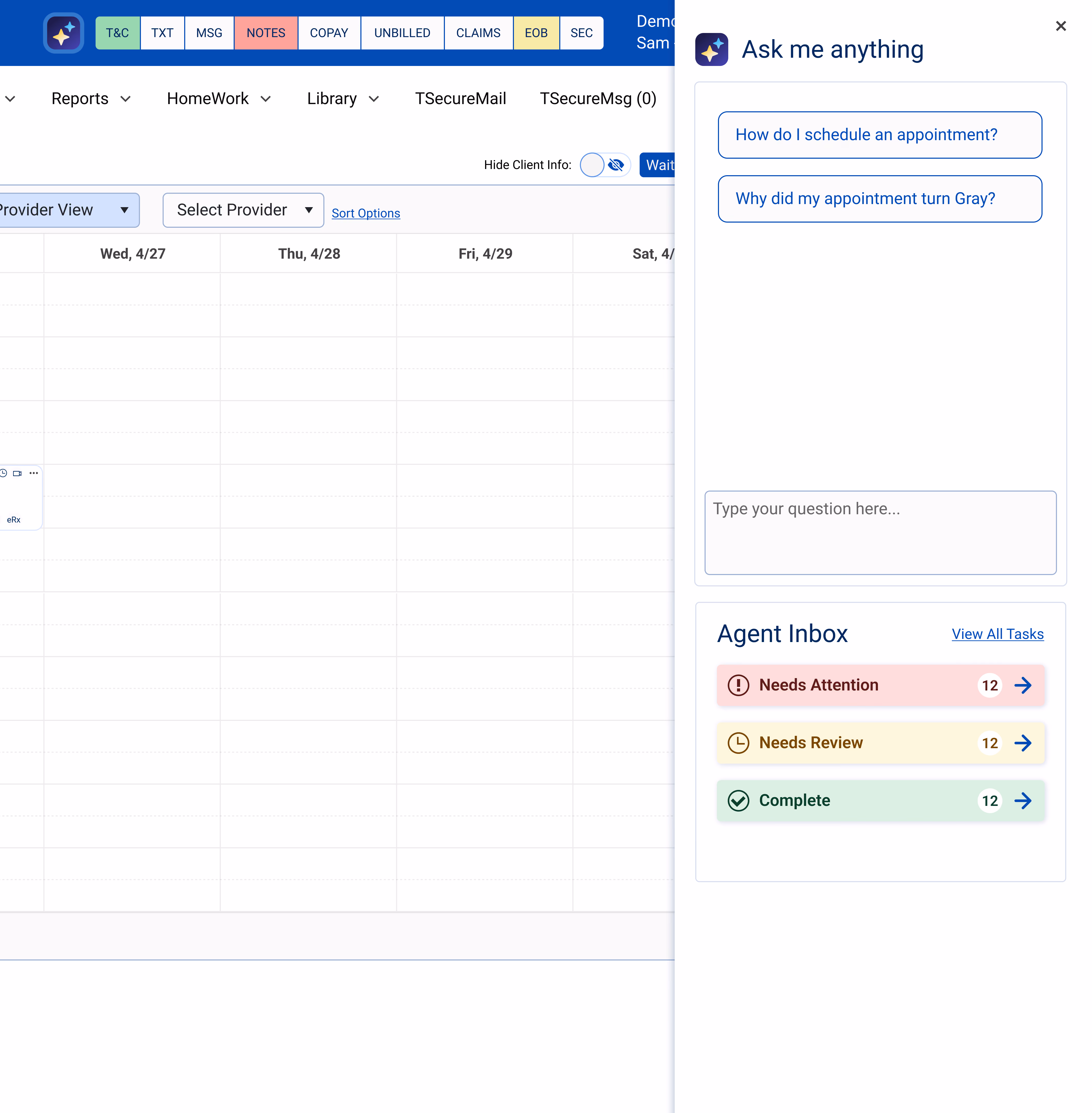
The default approach would have been to embed AI wherever it was useful, a button on the calendar, another in notes, another in billing. I rejected that early, because scattering AI across the product is exactly what would have amplified the fears customers already had: not knowing where AI lived, when it was running, or how to switch it off. So the framework did the opposite. One context-aware side panel became the single front door for everything AI — visible, predictable, and closable. The architecture was the trust principle made physical: if people are wary of AI being everywhere, the design answer is to make it live in one place they control.
That panel reads the page you're on and pre-loads the questions you're most likely to ask before you ask them — on the calendar, it surfaces scheduling questions. One click into the agent inbox shows exactly what every agent has done, sorted by urgency: Needs Attention in red, Needs Review in amber, complete in green.
The agent inbox shows what every agent has done, sorted by urgency: Needs Attention in red, Needs Review in amber, complete in green — the same four states across all agents. (agent inbox: proposed concept, did not ship)
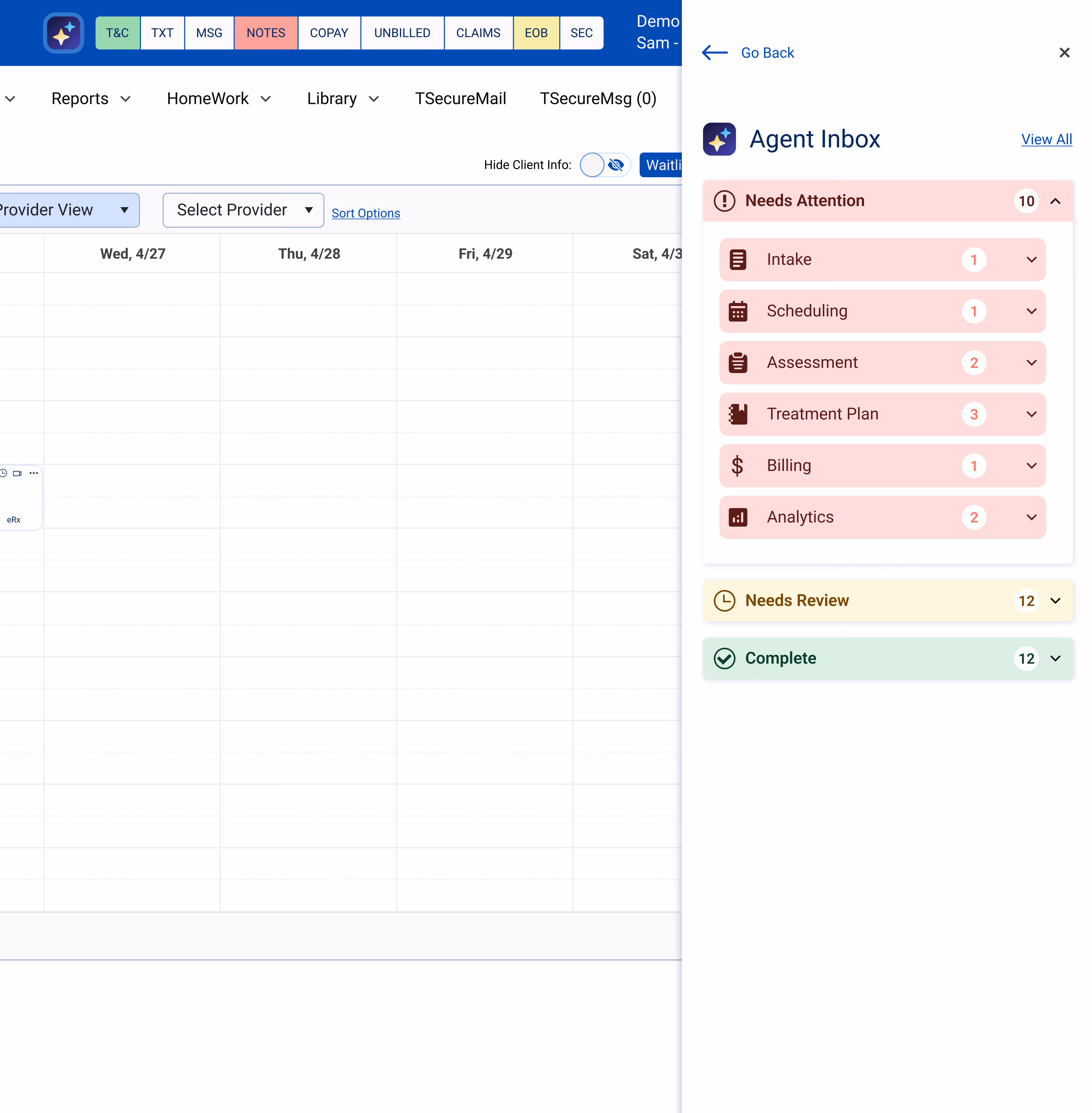
The agent inbox shows what every agent has done, sorted by urgency: Needs Attention in red, Needs Review in amber, complete in green — the same four states across all agents.
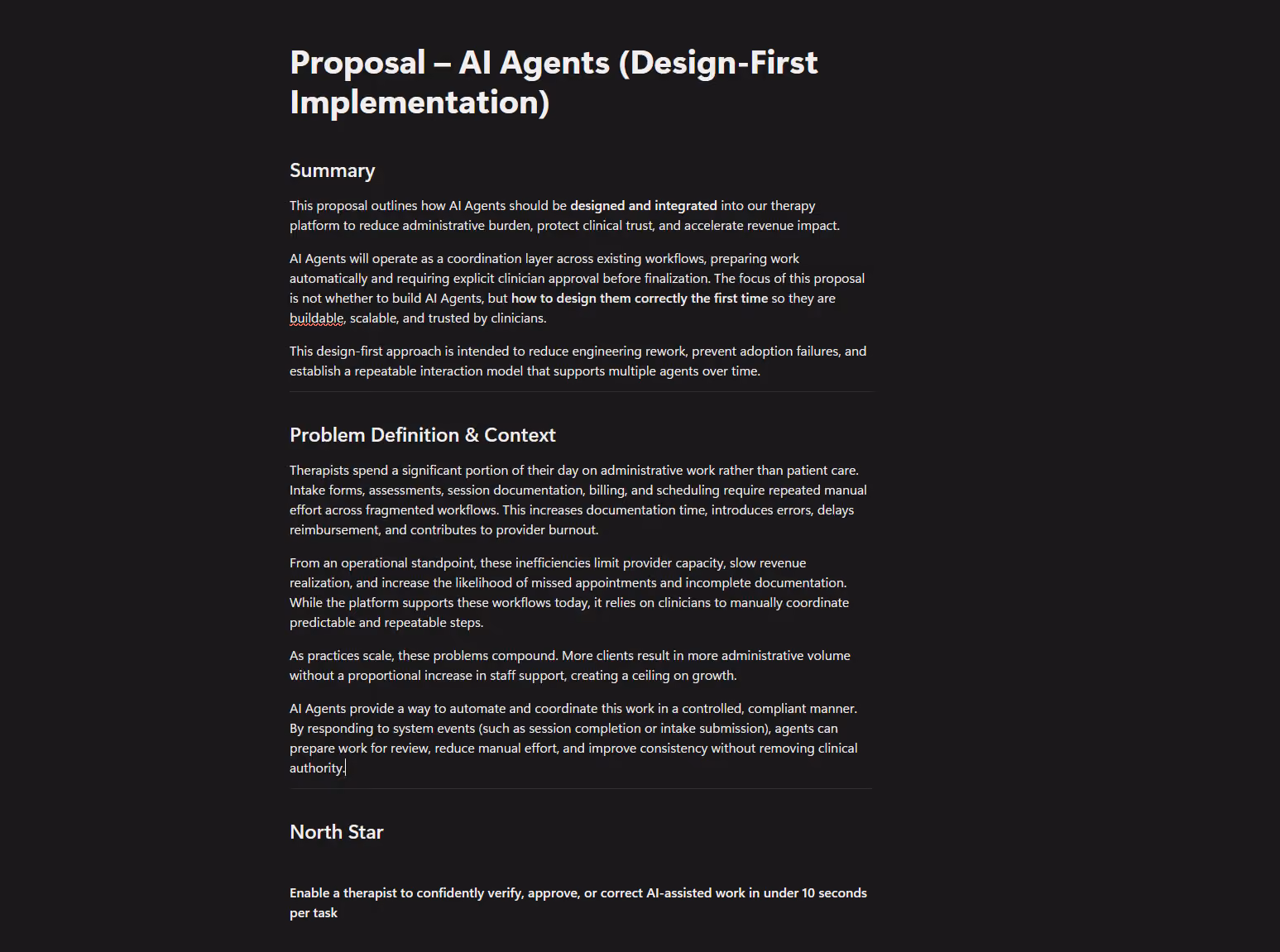
"The focus of this proposal wasn't whether to build AI agents — but how to design them correctly the first time, so they're buildable, scalable, and trusted by clinicians."
- From the original design-first proposal